
Brand Visual Identity
Vishnu brand is a newly established company in the field of luxury construction equipment.
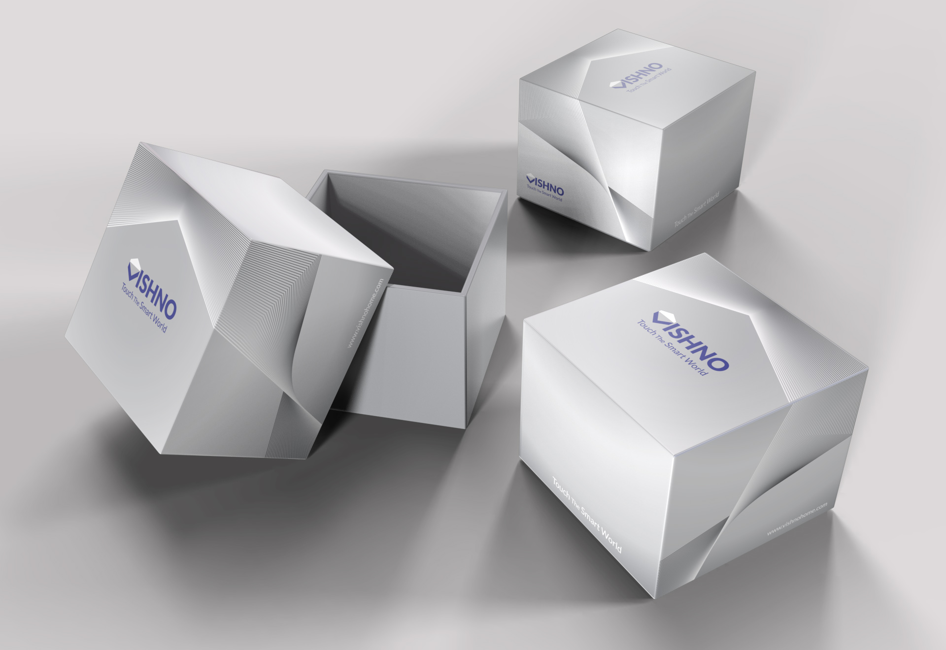
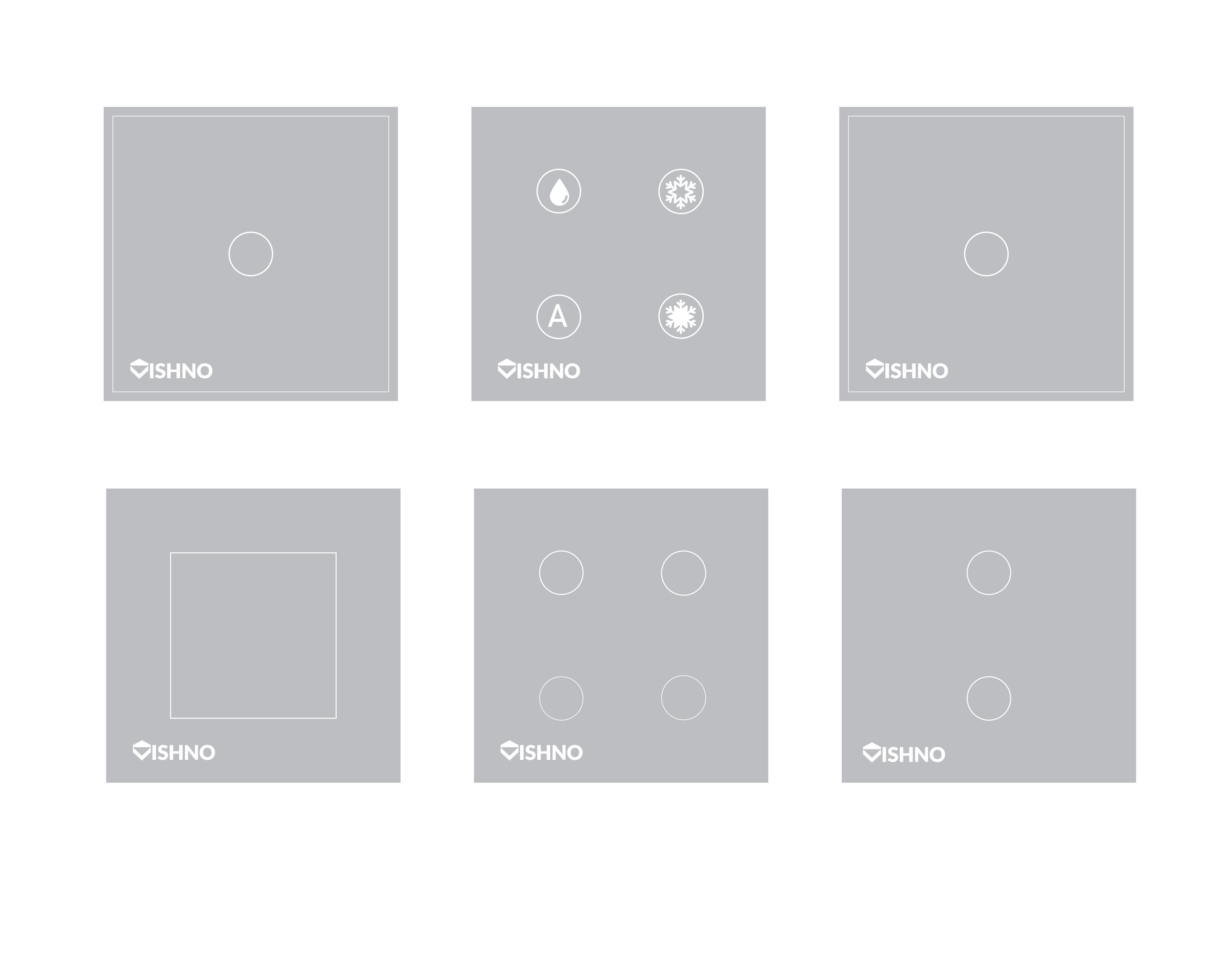
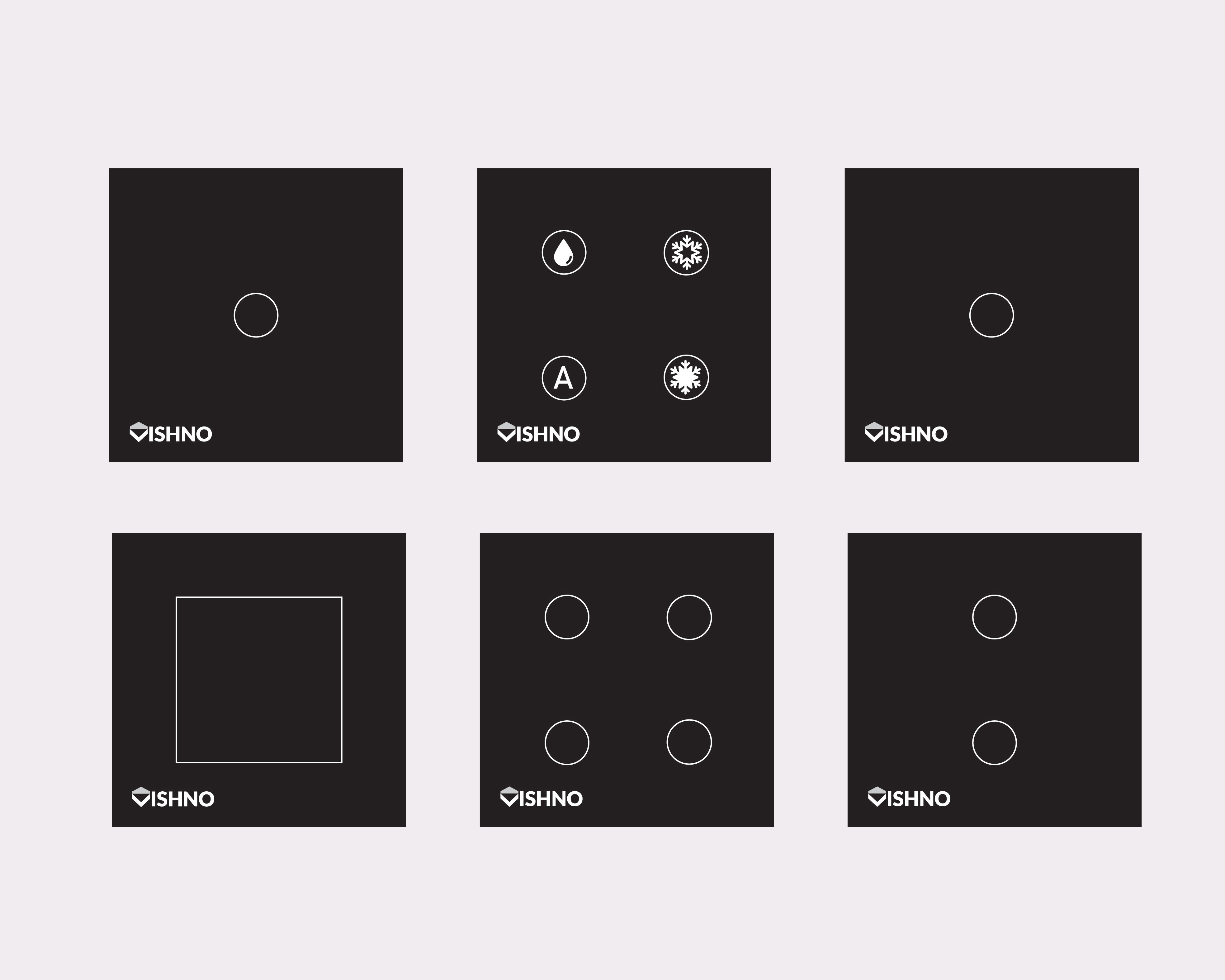
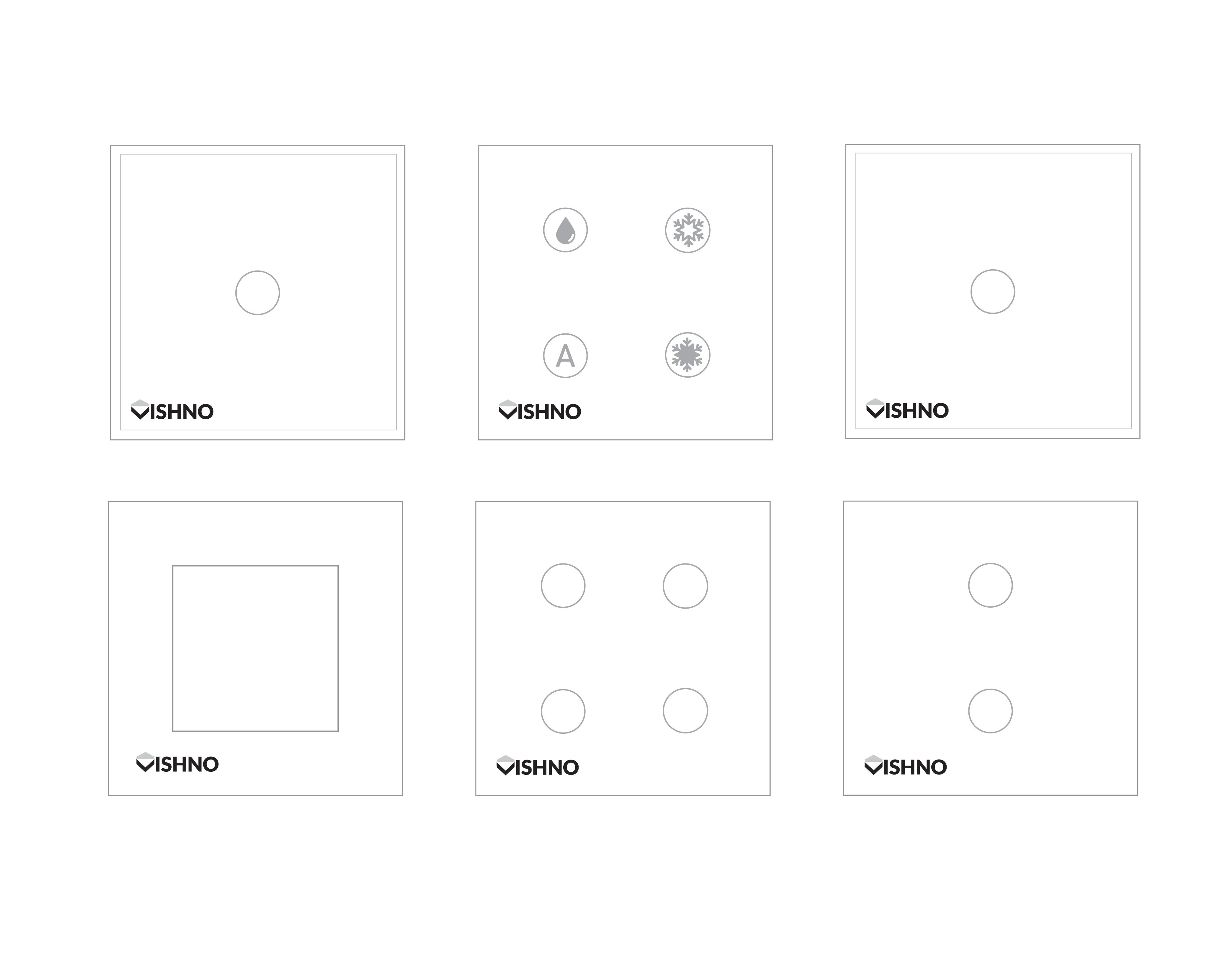
Touch keys are the first product of this company.
The visual identity of the Vishnu brand started with the logo design. The brand logo design was designed based on the target community, very simple and also with broken lines.
Also, the element of the house was used at the beginning of the logotype so that it can easily remain in the mind.
The next step was choosing the brand tagline, choosing the color, designing the keys and designing the packaging.
The main buyers of this product are architects for use in modern and minimal buildings.
The screen and icon design of these touch keys was done for single bridge, double bridge, three bridge, and four bridge.